
Reframe the goal of a self-serve product as making your solution easy to learn.
When talking about self-serve experiences, most founders focus on whether the product is easy to use. An easy-to-use product is necessary but not sufficient in a PLG motion.
Visualize the very first time a user is trying your product as them standing at the lip of a chasm. The chasm might be fairly easy to cross but still requires a leap of faith because your user has never leaped across this chasm before. They don’t know where or how easy it is to leap from.
Your product is the promised land opposite of this easy-to-use chasm. Adding a bridge will make your product easy to learn. The bridge to the promised land gives your user confidence to take each step needed to get across safely. Somewhere on this bridge is where they’ll experience their “aha!” moment — the moment that they can finally see the promised land clearly for themselves. They now believe that this product is easy to use because they learned how.

If you reframe the goal of a self-serve product as making your solution easy to learn, it opens your team up to ideas for the product roadmap that they might not even think of as a part of their core product. But this focus on speed of learning can make complex products easily accessible and bring down your TTA to 5 minutes.
Here are 6 specific methods that you can use either as stand-alone or in combination to design your bridge to the promised land:
.png)
When your user signs up and creates an account to try your product for the first time, what do they see? For many companies, the answer is nothing. The user sees an empty product space with some kind of “blocking” step they’re not ready/able to take, such as “connect with X” or “upload data in format Y.” Your user might not have the credentials to “connect with X” or not know exactly what you expect when you say “format Y.” They immediately lose confidence and move away from your product. You’ve given them a reason to procrastinate. Instead, you could offer pre-populated templates or step-by-step walkthroughs of your product. Here are two of my favorite examples of this from Webflow and Airtable.
Webflow offers pre-populated templates to browse and choose from:
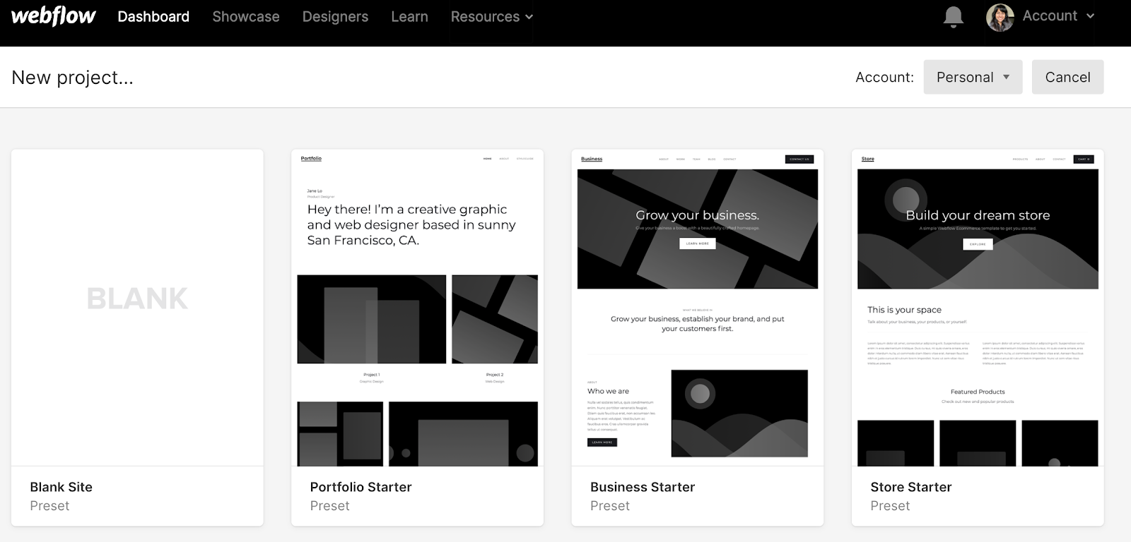
Webflow is a no-code platform for web design and development.
Imagine you are a new user to Webflow and are greeted by a blank site when you click on “new project”. The likelihood that you would appreciate Webflow’s value proposition is very low. Instead, they start you off with three options for starter templates based on their target customer personas — designers and web managers for SaaS and e-commerce companies. With a few clicks, you already have your first aha moment.
Airtable offers a slick product walk-through of a template to learn
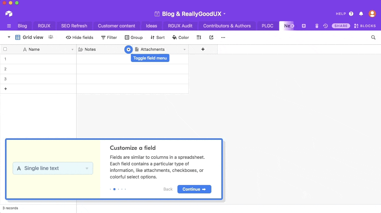
Airtable is a spreadsheet-database hybrid and low-code platform for building collaborative apps.
People use Airtable to manage projects, track and organize inventories, plan events, and more. It can be very challenging to activate users in a product that is so flexible it can do a bit of 10 different products you have used in the past. Where does one start? Airtable addresses this issue by combining the same tactic you saw Webflow employ (a template pre-filled for a target customer profile) with a simple walkthrough that highlights their differentiated functionality. With every explanation, they highlight what their users weren’t able to do easily in their status quo — spreadsheets — leading to their first “aha!”
Oftentimes, the best way to scope your self-serve MVP is to mimic week one of your typical enterprise customer’s experience with your product. How can you unlock the first week of value with a few clicks? If you can do that — the rest of the implementation might take months — but your customer is now activated and committed. So use your private beta phase to identify what a minimal implementation design would look like and give your customers week one of value out-of-the-box in less than 5 minutes.
New Relic: Immediate OOTB value post-SDK install
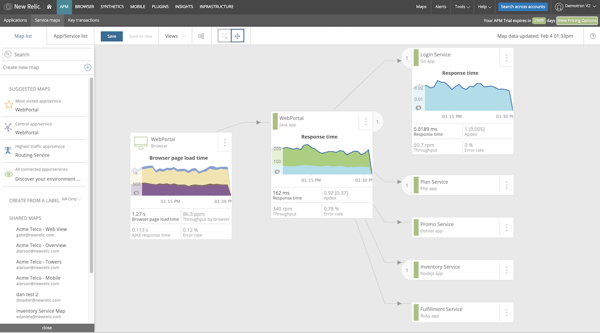
New Relic is cloud-based software that helps website and application owners track the performances of their services.
With an APM (app performance monitoring) tool like New Relic, the end user is an engineer who can install the SDK. Minutes after installing the SDK and restarting, the user has graphs and call trees that show a map of all the active functions in the application. Bill Hodak, New Relic’s first PMM (product marketing manager), and now marketing partner at Unusual Ventures, recalls this about the early UX at New Relic. “Most people found some surprises immediately,” he says of the cloud-based observability platform. “Down the road, users could do configuration and custom instrumentation to get more visibility than the out-of-the-box experience, but that start was enough to provide immediate value in their first week.”
Oftentimes your product requires a lot of data from customers to demonstrate its value. With increasing security barriers within companies, it has become challenging to offer a low-friction self-serve experience for data products. A great way to circumvent this is by utilizing dummy data that your users can leverage to understand what kind of insights you would offer them with it.
Amplitude: public demo with realistic data sets
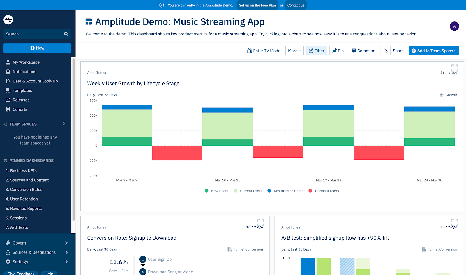
Amplitude is a product analytics platform that helps teams understand and optimize digital user behavior.
When you get started in Amplitude, you can choose one of many demo apps (media, e-commerce, collaboration, etc.) to analyze without sharing your own company’s data. Your “aha!” could come from discovering the easy retention analysis you have wanted for weeks but couldn’t get from your internal analytics team.
Not every product lends itself to templates or sandboxes. Learning by doing (not just seeing) is one of the best ways to understand a new concept, which is what I call the “sherpa approach.” In a Sherpa approach, the product offers a step-by-step, learn-by-doing guide that progresses alongside you. Below are examples from LaunchDarkly and Loom that have used a Sherpa approach to help their users learn by doing. By the time you’ve walked through their tutorials, you’ve essentially used the MVP completely.
LaunchDarkly: start with a learn-by-doing tutorial
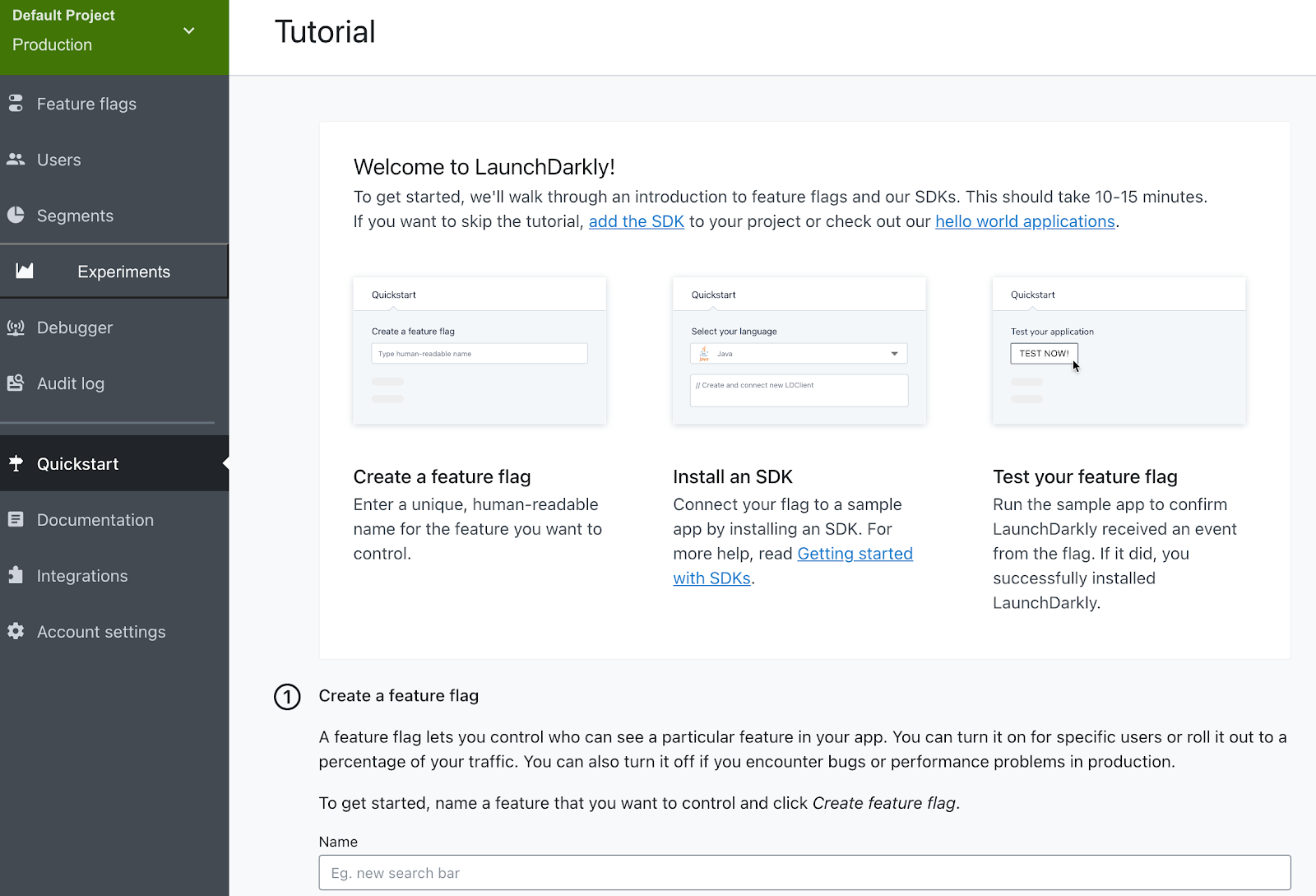
LaunchDarkly is a continuous delivery platform that provides feature flags as a service and allows developers to iterate quickly.
Great documentation is extremely critical for Sherpa onboarding in dev tools. This should be treated as a first-class citizen of your product experience, not an afterthought to describe the day before you launch. In fact, the documentation IS the product. Put yourself in the developer’s shoes. Until they have implemented the software (using the documentation you provided) there is no value created.
Loom: Drive desired actions through a checklist
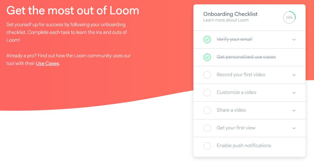
Loom lets users record audio, video, browser windows, and entire screens in a Chrome extension, desktop app, or mobile app.
Another great example of Sherpa onboarding was the early user activation flow used by Loom. They broke down the individual steps their customers needed to take to quickly understand Loom’s differentiated value proposition. This checklist above highlights the ease of customization and sharing they offered (aha!) as well as ensuring that the user is notified of the views on their first video to bring them back a second time.
For products that require users to first ingest new types of knowledge, a video tutorial course can be extremely effective. If you believe a lot of end users might be new to their jobs or the specific problem that you address, educating them on how to approach it is the best marketing content and self-serve product experience you can offer.
Styra: a 30-lesson program to teach users about open policy agent (OPA)
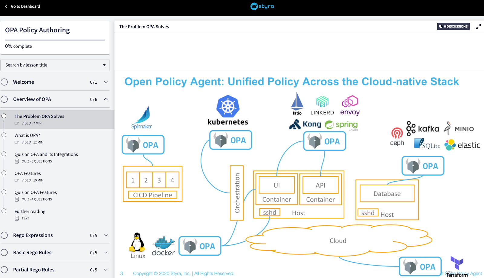
Styra enables businesses to validate Kubernetes security.
Styra leads a vibrant open-source community for OPA (open policy agent) with hundreds of millions of downloads. Their introductory content helps their users become OPA experts before they get exposed to Styra’s product itself.
If you were born before the ’90s, you probably remember Clippy. I like to think that Clippy was just way ahead of his beady-eyed time back in 1997. The capabilities of virtual assistants have come a long way since then, and if your product facilitates collaboration, a friendly bot is a great way to get new users started!
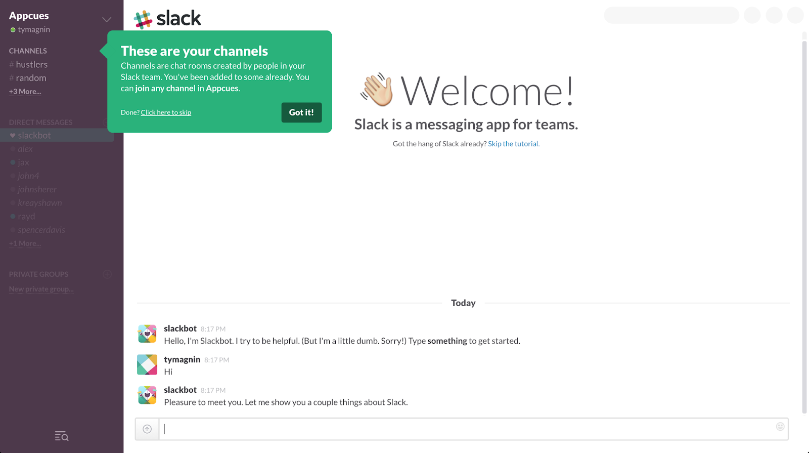
Slack is a team communication and collaboration platform.
The infamous Slackbot serves multiple purposes for a new user. It’s a conversational walkthrough of key features on the surface but implicitly also pushes you to start using the product in a safe environment (no one sees what you typed) on your own. With Slackbot, you can get to an ‘aha!’ moment without waiting for someone else from your team to accept an invitation to join your workspace to start chatting.
A small early-stage team can’t test or implement all these tactics, so it’s best to choose one or two based on the nature of your product. Here’s a summary of tactics that we’ve found work best based on your company’s specific PLG mode (fast-working, habit-forming, or paradigm-shifting). (Refer to the Intro to PLG to refresh your memory on the three primary PLG modes and their criteria.)
.png)
Now that we’ve walked through six methods to build a great self-serve MVP, let’s talk about some of the mistakes founders often make that result in poor user activation.
The best way to avoid this is a rigorous private beta phase along with dark launches to test the messaging and sign-up flows.
To avoid this from happening, inform users who they might need to work with in order to get the product activated. For example, build in an auto-email when a user reaches a certain product milestone to let them know that they will most likely now need to whitelist IPs, what that means, who they should ask in the organization, and what they should do next.
Three of the important takeaways for me as a practitioner: